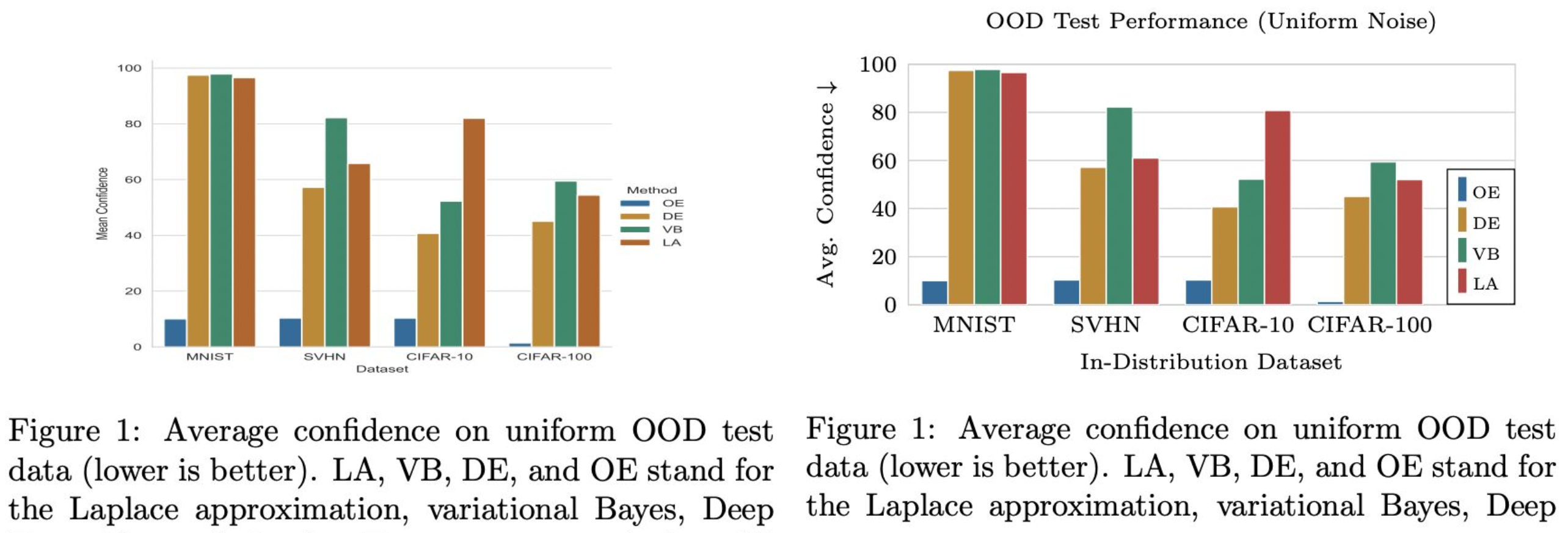
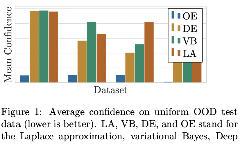
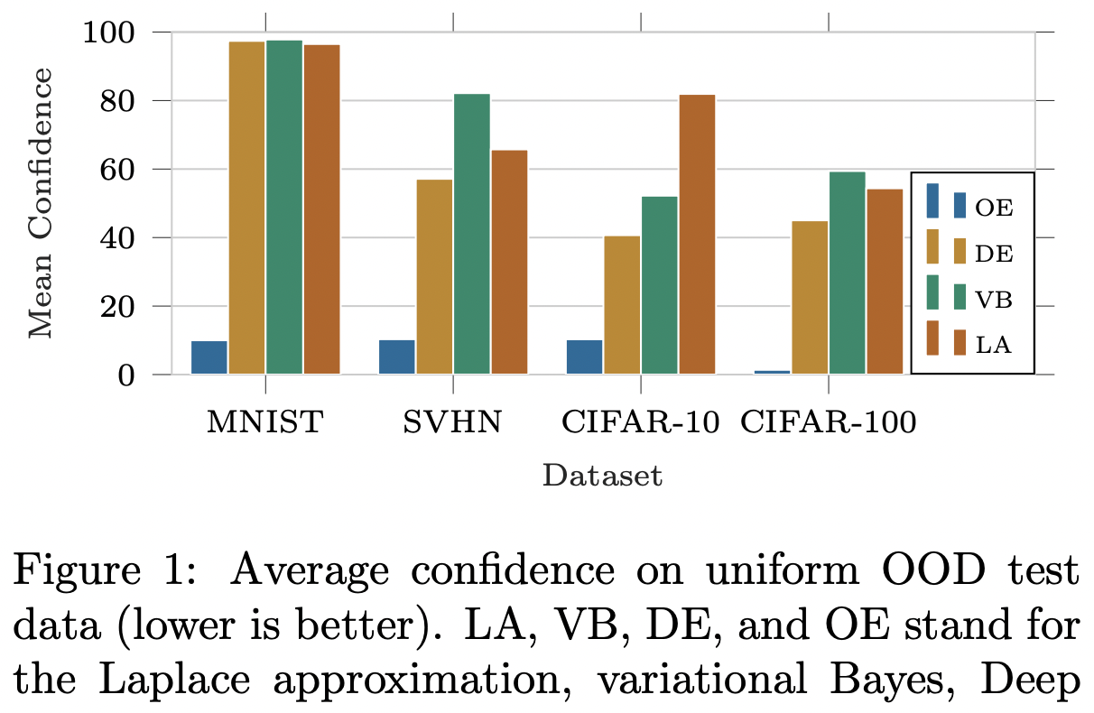
Let’s start with a side-by-side comparison. Which one of the following two plots is more aesthetically pleasing? Left or right? (Taken from one of my papers [1]. The code for generating it is in [2])

Hopefully, you agree with me that the answer is the one on the right. In that case, we can start our journey in transforming the l.h.s. figure to the r.h.s. one.
Elements of publication-ready plots
Over the year of writing papers, I’ve come to realize some patterns in creating publication-ready plots. Note, I’m not even talking about the content of the plot itself—this is more about how to make your plots fit your paper well. This is essentially the “last mile” of making publication-ready plots, which, sadly, is something that many people ignore.
Anyway, those elements are:
- Must be a vector graphic (pdf, svg, etc.).
- Should fill the entire
\linewidth(or\textwidth) of the page. - Must not be stretched disproportionally.
- The font face must be the same as the text’s font face.
- The font size can be smaller than the text’s font size, but must still be legible and consistent.
One way to tell that one’s plot is not publication-ready is if one uses Matplotlib without further touching its rcParams, and simply “pastes” it to the paper’s .tex file with \includegraphics.
Below, I show how to ensure the elements above by leveraging the powerful TikZ.
Note that one can also do this by modifying the rcParams of Matplotlib, but I only do this in a pinch—I will talk about this in a future post.
TikZ-ing your Matplotlib plots: A basic workflow
TikZ is great because it’s tightly coupled to LaTeX, which we already use for writing the paper. So, TikZ plots will respect the styling of the paper by default, making them aesthetically pleasing out of the box. However, TikZ is notoriously difficult to learn.
But, what if I told you that you don’t need to understand TikZ to use it for making publication-ready plots? The Tikzplotlib library will do all the hard work for you, and all you need is to customize the styling once. Then the resulting plot can be reused over and over again e.g. slides and posters without modification.
So, here’s my workflow for creating a publication-ready plot, from start to finish.
-
Create a Matplotlib plot as usual.
-
Instead of
plt.savefig(figname), do:import tikzplotlib as tpl# Create a matplotlib plot...# Save as TikZ plottpl.save('figname.tex', axis_width=r'\figwidth', axis_height=r'\figheight')Here’s an example file you can use to follow this tutorial along:
-
Copy
figname.texto thefigsdirectory in your paper’s LaTeX project. -
In the preamble of your paper’s LaTeX file, add:
\usepackage{pgfplots}\pgfplotsset{compat=newest}\pgfplotsset{scaled y ticks=false}\usepgfplotslibrary{groupplots}\usepgfplotslibrary{dateplot}\usepackage{tikz} -
In your
.texfile, do the following to add the figure:\begin{figure}\def\figwidth{\linewidth}\def\figheight{0.15\textheight} % Feel free to change\input{figs/figname}\end{figure}Note that
\figwidthand\figheightare local variables, so their values will only be used forfigname. -
At this point, you will already have a quite aesthetically pleasing figure, cf. below. Notice that the font face and size are consistent with the paper’s text. However, notice that we need to improve the plot further, e.g. by unhiding the x- and y-tick labels.

-
Open
figname.tex. You will see the following code:\begin{axis}[width=\figwidth,height=\figheight,axis line style={lightgray204},tick align=outside,unbounded coords=jump,x grid style={lightgray204},xlabel=\textcolor{darkslategray38}{Dataset},xmajorticks=false,xmin=-0.5, xmax=3.5,xtick style={color=darkslategray38},xtick={0,1,2,3},xticklabels={MNIST,SVHN,CIFAR-10,CIFAR-100},y grid style={lightgray204},ylabel=\textcolor{darkslategray38}{Mean Confidence},ymajorgrids,ymajorticks=false,ymin=0, ymax=102.714733242989,ytick style={color=darkslategray38}]You can think of this as the “CSS” of your plot.
-
First, add the line
\tikzstyle{every node}=[font=\scriptsize]before\begin{axis}. This will scale all the font in the plot to\scriptsize, which I think is more pleasing, while still legible. -
To unhide the x- and y-tick labels, simply change
xmajorticksandymajortickstotrue. -
Moreover, notice that we don’t have much space for the legend. So, we need to customize it. Change
xmaxto4.1and add the following option:\begin{axis}[...legend style={nodes={scale=0.75, transform shape}, at={(1,0)}, anchor=south east, draw=black},...]The change in
xmaxwill make some room to the right of the plot, while thelegend styleoption will scale down the legend and move it to the lower-right portion of the plot.
Here’s the final result:

Looks much more pleasing than the standard Matplotlib output, isn’t it? Note that we didn’t change many things other than refining the styling options of the TikZ axis—we didn’t even touch the plot content itself!
If you noticed, at this point, we already pretty much fulfilled of the elements of the publication-ready plots we discussed previously. I personally think that this level of aesthetic is more than acceptable for publication.
But, to me, the plot can still be refined further.
- First, notice that the plot still doesn’t fill the whole text/column’s width.
This can be fixed by increasing
\figwidthto e.g.1.04\linewidth. - Second, the y-axis is too tall: it exceeds the maximum value of the data (100).
To fix this, simply set
ymax=100in the axis option infigname.tex. - Furthermore, the ticks on the axes (not to be confused with the tick labels) are unecessary. We can hide them setting
xtick style={draw=none}andytick style={draw=none}. - Last, the legend looks ugly to me: for some reason by default TikZ uses two bars in the legend.
The fix is to add the following before
\begin{axis}or in the preamble ofmain.texto make it global:
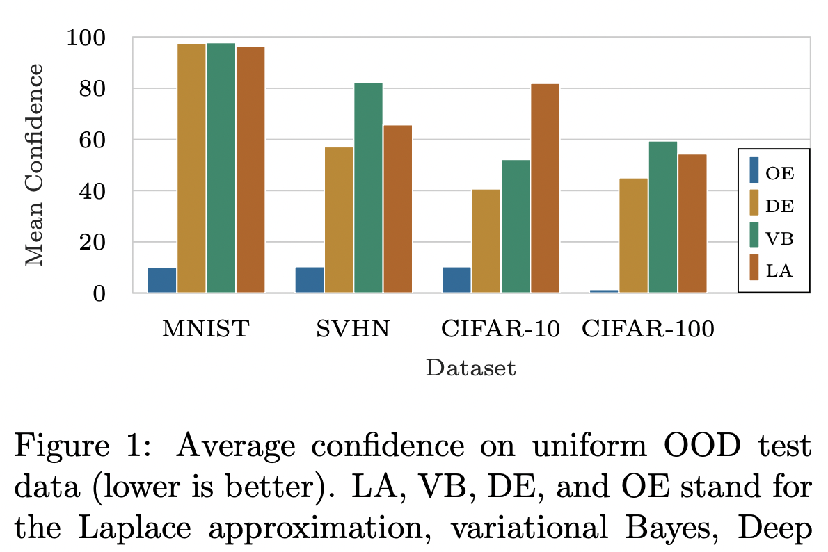
\pgfplotsset{compat=1.11, /pgfplots/ybar legend/.style={ /pgfplots/legend image code/.code={ \draw[##1,/tikz/.cd,yshift=-0.25em] (0cm,0cm) rectangle (3pt,0.8em);}, },}Putting everything together, here’s the final result:

Looks great to me!
As a bonus, this plot (i.e. the figname.tex) is highly portable.
For example, when you want to reuse this plot in a Beamer presentation or poster, you can simply copy-and-paste figname.tex and include it in your presentation’s .tex file as above—you only need to change the values of figwidth and figwidth.
All the refinement done previously will carry over and the plot’s style will automatically adapt to the style (e.g. font face and size) of your presentation!
Miscellaneous Tips
Suppose you have two plots that you want to show side-by-side in a figure:
\begin{figure}[t]    \def\figwidth{0.5\linewidth}    \def\figheight{0.15\textheight}
    \centering
    \subfloat{\input{figs/fig1a}}    \hfill    \subfloat{\input{figs/fig1b}}\end{figure}
How do you make sure that they are perfectly aligned?
Easy: simply add baseline option at the \begin{tikzpicture} line of both fig1a.tex and fig1b.tex, i.e.,
\begin{tikzpicture}[baseline]
...
\begin{axis}[...
There are also trim axis left and trim axis right options for tikzpicture.
As the names suggest, they can be used to tell LaTeX to ignore the left and right axes of the plot when computing the plot’s width.
They might be useful in some niche situations.
Faster compilation
If your paper has many complex TikZ plots, it can happen that your LaTeX compilation is slow.
To mitigate this, we can “cache” the compiled TikZ plots.
To do so, we can use the external package: In your LaTeX preamble, add the following.
\usepackage{tikz}\usetikzlibrary{external}\tikzexternalize[prefix=tikz/, figure name=output-figure]Then, create a directory called tikz/ in your main project directory.
This will be the directory external will cache your compiled TikZ plots.
Note that this is “trick” is fully compatible with Overleaf.
In case you want to disable externalize for one of your plot, e.g. for debugging, you can “surround” your TikZ plot with \tikzexternaldisable and \tikzexternalenable.
\begin{figure}[t]    \def\figwidth{\linewidth}    \def\figheight{0.15\textheight}
    \centering
    \tikzexternaldisable    \input{figs/figname}    \tikzexternalenable\end{figure}
Final remark
Last but not least, my final tips is: utilize Google search and Stackoverflow if you need more advanced styling. You will more often than not find your questions already answered there.
References
- Kristiadi, Agustinus, Matthias Hein, and Philipp Hennig. “Being a Bit Frequentist Improves Bayesian Neural Networks” AISTATS 2022.
- https://github.com/wiseodd/bayesian_ood_training/blob/master/notebooks/plot_uniform.ipynb.